The Strange Tale of the Seattle Apartment Building Investment Cycle and Maybe Yours Too.
Back in 2012 it appeared that Seattle’s movement through the real estate cycle was stalling out. Not the actual market by any stretch of the imagination but instead where it was placed on the apartment market cycle charts in the Cycle Monitor report from Dividend Capital Research. These quarterly reports on the real estate market cycles for the five main Commercial Real Estate (CRE) sectors in more than fifty markets around the US were widely followed but something was wrong.
Click on images for full size.
Why this up to date proprietary data is vitally important to your investment success:
You can fix a property but not a market cycle. Knowing where a market is in its cycle is critical for investors seeking to buy low and sell high. If signals are a year or more behind, prime opportunities will be missed to acquire properties before the crowd wants in and pushes up prices.
The reports are written by Dr. Glenn Mueller, one of the leading experts on real estate market cycles who published his first paper on them back in 1995 when he was National Director of Real Estate Research at Price Waterhouse (now PWC): Mueller, G. R. (1995). Understanding real estate’s physical & financial market cycles. Real Estate Finance, 12(3), 51-64. I can’t find a source online for that paper but here is a link to his 1999 paper: Real Estate Rental Growth Rates at Different Points in the Physical Market Cycle.

Professor Mueller has presented his work in testimony to Congress as well. His presentation has expanded over the years but the core understanding of CRE market cycles remains. Here are slides from a presentation last year: Commercial Real Estate and Market Cycles March 2014.
So he knows what he’s doing and has been doing it a long time, you could say he wrote the book on CRE market cycles. But still as I’ll show something definitely went awry with Seattle’s trip through the apartment real estate cycle. In doing so I’ll cover a number of issues that investors and advisors should be aware of when using research provided by sources that do not have a strong local presence in your target market.
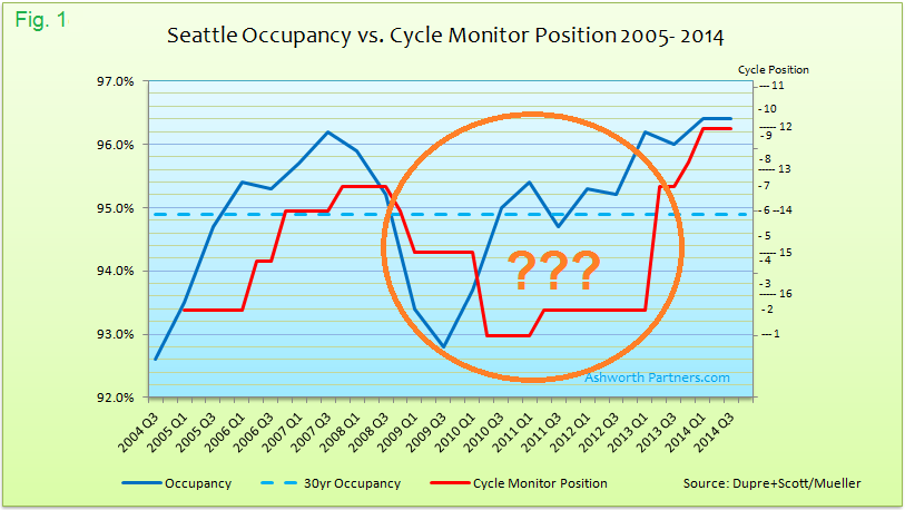
The problem was that while the Cycle Monitor had Seattle apartments stuck in the depths of the cycle at position 2, the actual market was exploding particularly on the new construction side:
See Apartment Building Investment Cycle Analysis via Dividend Capital. Can this be right? on our blog, as well as here and here and here for how things were actually going at the time. In trying to figure out what was amiss I started by charting out where Seattle had been placed in the cycle over time:
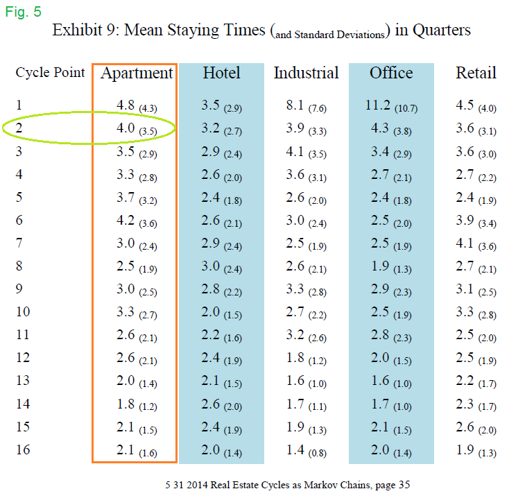
The chart above shows that position 2 near the bottom of the cycle is Seattle’s most often located position having been placed there for thirteen of the thirty nine quarters since the beginning of 2005. That’s a perfect third of the time that Seattle’s been in just one of the sixteen different positions in the cycle. How often does that happen? Well interestingly enough Dr. Mueller and his colleague Richard D. Evans just published some research on that exact subject which was presented April 3, 2014, at the meeting of the American Real Estate Society. The title was Forecasting Five Property Types’ Real Estate Cycles as Markov Chains and it contained this table:
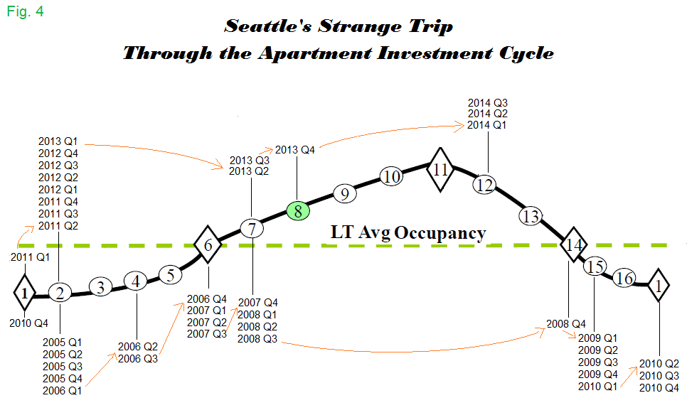
I converted the apartment column to a chart and plotted Seattle’s stay in position 2 (red diamond) from 2011 Q2 to 2013 Q1:
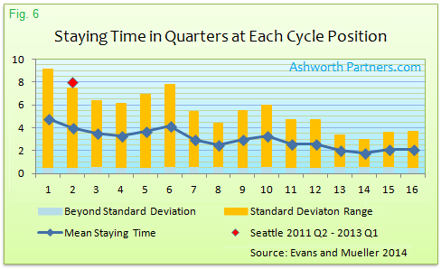
What we see is that although the mean staying time for apartments in position 2 is four quarters, Seattle’s was double that at eight which puts it more than a standard deviation above the mean. Well yes you might say but things should fall outside 1 standard deviation almost a third (31.73%) of the time. Point well taken and absent any other evidence I would just let it go at that. But we’ll see below that there is plenty of evidence to the contrary.
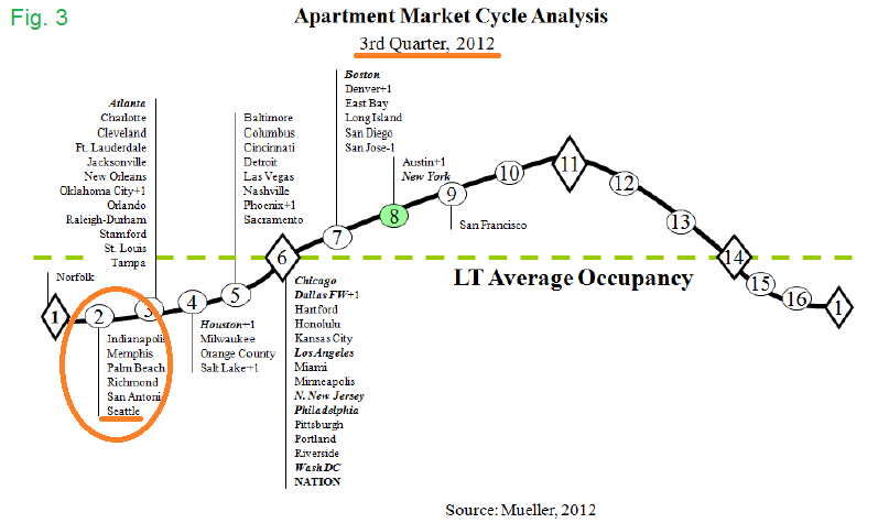
As an interesting side note, in section III. A. of Forecasting Five Property Types’ Real Estate Cycles as Markov Chains authors Evans and Mueller mention that Integrity Realty Resources also uses the same methodology in determining their market cycle positions and so we’ll have a look at their placement of Seattle’s apartment market cycle later as well.
Turning to the data, based on everything I’ve read by Mueller (which he recaps on page 2 of every Cycle Monitor) there are five pieces of information needed to determine the cycle position which are the answers to five very simple questions:
- Is vacancy* rising or falling?
- Is vacancy* above or below the long term (30 year) average?
- Are rents rising or falling?
- Are rents growing above inflation?
- Is new construction taking place?
* Alternatively, is occupancy falling or rising/ below or above. Occupancy is the inverse of vacancy. Note when looking at market cycles, occupancy is usually displayed because it maps pretty well to the cycle. When looking at rent growth, vacancy is usually displayed because they can both use the same percentage scale.
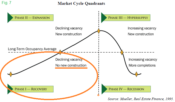
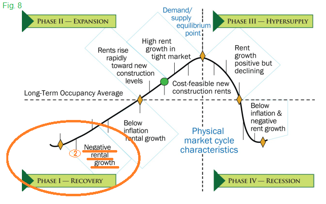
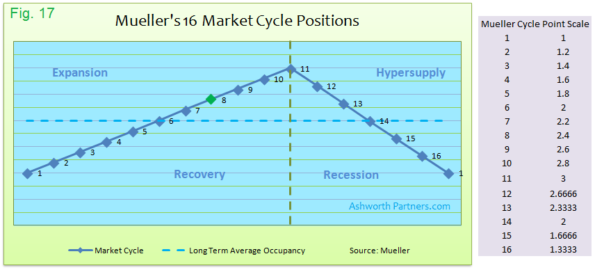
Looking at the two illustrations above (from Mueller’s page 2 recap) we can determine what the answers should be for a market to be in position 2 of its cycle:
- Is vacancy rising or falling? Falling (Occupancy Rising)
- Is vacancy above or below the long term average? Above (Occupancy Below)
- Are rents rising or falling? Falling
- Are rents growing above inflation? Below
- Is new construction taking place? No
Position 2 indicates (or it should) that rents are falling, occupancy is rising but below its Long Term Average (LTA) and there’s no new construction (See Figs 7 & 8, above). If occupancy is above its LTA the cycle must be in the Expansion or Hypersupply phase, not in the Recovery phase. If rents are rising but below inflation the cycle must be later in the Recovery Phase. If rents are rising above inflation the cycle must be already in the Expansion Phase. And of course there can be no new construction.
The Seattle apartment market is very fortunate to have an excellent source of data in Dupre + Scott Apartment Advisors who have been collecting data more than 35 years. This works out well because Professor Mueller uses the 30 year LTA vacancy/occupancy as the dividing line between the phases seen above. Unsolicited testimonial: If you are in the apartment business in Seattle, or even considering entering that market, subscribe to Dupre + Scott’s services. Otherwise you’re playing with one arm tied behind your back. When I first started out there a wise old hand told me everybody reads Dupre + Scott and that was great advice. Now back to our regularly scheduled report:
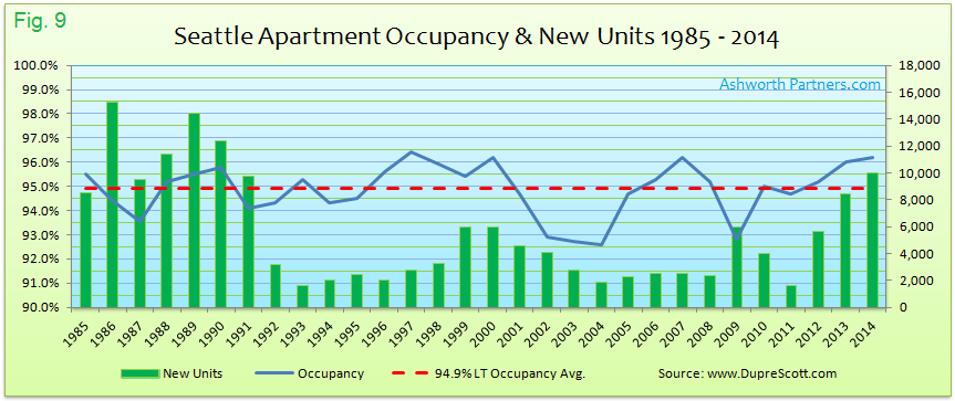
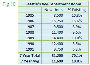
A couple things stand out in this chart every time I look at it. First, the lowest occupancy over the last thirty years was in 2004 at 92.6%. Compare that to many other markets around the country which average 8 or 10% vacancy (8.4% long term nationally) and Seattle looks pretty good from an operating standpoint. The second thing is that while everyone in the market is concerned about the amount of new supply coming online these days it really pales in comparison to the 1985-91 period. That was a real boom, especially as a percent of existing supply:
Looking at new construction we come to a ‘what the meaning of the word is is’ question; what does the no in ‘no new construction’ mean? Typically, no means nada, none, zip, zilch, zero but looking at the long term chart above there’s never been ‘no new construction’ in the last thirty years. So does that mean Seattle’s cycle hasn’t been in the recovery phase once in thirty years or, maybe like is, no has a subtler meaning.
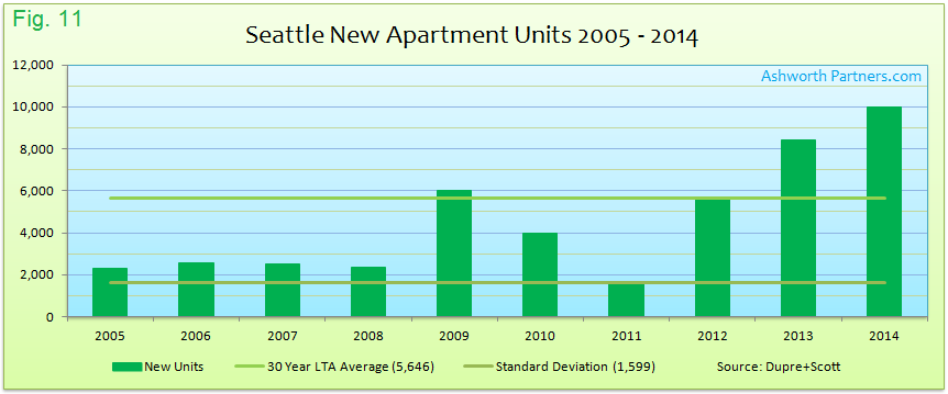
Given that there’s never been zero I looked at standard deviations of the LTA and at the lower range it was 1,599 new units by which standard means that even the two 1,600 new unit years would clear the no new hurdle by one single unit. Since a counting error could throw that either way so I kept analyzing.
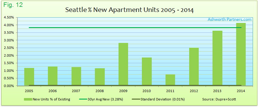
I also looked at new units as a percent of existing which is probably a better way to measure new supply but the lower limit of the standard deviation is just 0.01% so not helpful. I include the chart below to point out that while there’s been a lot of hand wringing about ‘all’ the new supply coming online the last few years, it only just go back the LTA in 2013 and just above in 2014.
It may just be that for Seattle’s apartment supply growth, sixteen hundred is the new zero. The zombies rise up and everyone runs off into the hills but somehow there are still 1,600 new units. In 2011 1,600 new units was .75% of existing and the bar would have to be set higher than 1% or 2,350 units to take out 2005 and 2008; 1.25% or 2,500 to take out 2006 and 2007 as well.
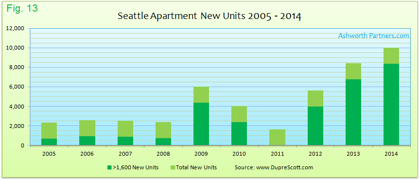
The chart above shows 1,600 new units in the light green and anything over 1,600 in dark green. 2011 is the only year in the last 10 that would qualify under the modified ‘no new construction’. And actually in ’05 – ’08 the low levels of new construction only applied to for-rent apartments. There was a serious construction boom going on, but it was for condos. At one point in that period 75% of the tower cranes on the west coast were working in the Seattle market and the running joke was that the crane should be made the official bird of Seattle.
BTW the cranes have once again flocked to Seattle only this time they are building apartments. I was there for a conference recently and while sitting on the freeway en route I counted twelve that were easily seen at a glance. The CEO at one of the larger local property management firms told me during a break there are more than two dozen cranes in the downtown core alone erecting mid to hi-rise apartment buildings.
Looking at rent growth the first question is how best or often to measure the change since it can be noisy. Dupre + Scott collect rent growth data twice a year at the end of the first third quarters. On the chart below the 6 months’ rent change is plotted in yellow, the year-to-year annual in purple, the six month annualized in blue and the trailing two six month periods in green:
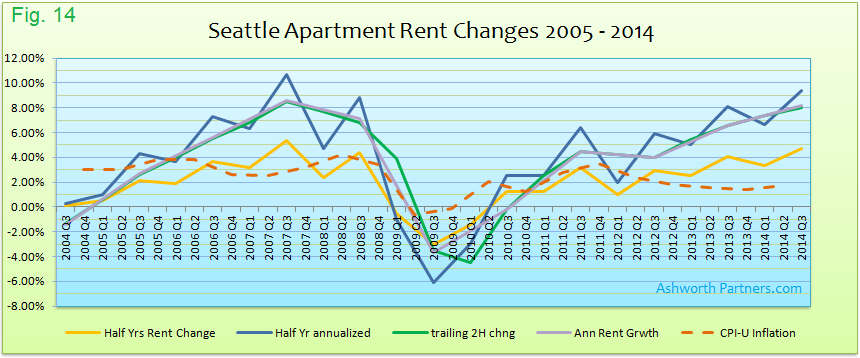
Because the questions we’re trying to answer about rents are whether they’re growing or not and if yes are they growing above inflation I believe the 6 months’ number annualized (x2) gives the best read on rent changes despite it being the noisiest. Note that according to Dr. Mueller’s methodology the relation between rent growth and inflation only matters in the rising part of the cycle.
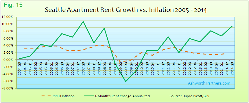
On the chart above you can see that rent growth rose above inflation in the first half of 2006 and then again in late 2010/early 2011 and has stayed above since Q3 2012. Note that the chart is showing Consumer Price Index for all Urban Consumers (CPI-U) first half and second half year over year changes from Table 24 of the CPI Detailed Report from the Bureau of Labor Statistics. Other measures of inflation may be used but love it or hate it, the CPI-U is readily available. Also when I corresponded with Dr. Mueller during my research (see below) he didn’t object to the CPI-U being used. Economists may (and do) have principled arguments about which measure to use which could (and do) fill entire books but that is outside the scope of this report.
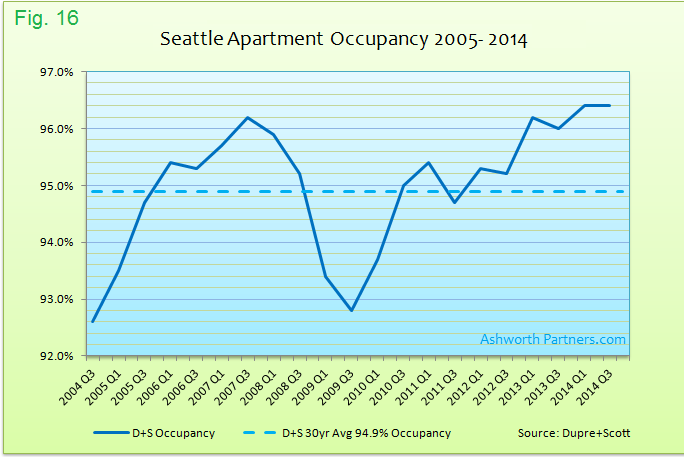
Below is Seattle’s apartment occupancy from 2005 through 2014 Q3. Dupre+Scott surveys occupancy twice a year, at the end of the first and third quarters. Occupancy in Seattle broke above the 94.87% long term average at the end of 2005 and stayed there until the end of 2009. It rose above it again in Q3 2010, dipped 20 basis points below briefly in Q3 2011 before returning above in Q1 2012 where it remains today:
So now all the pieces are here to answer the five questions and compare them to the Cycle Monitor’s positions for Seattle’s apartment market.
I have Cycle Monitor apartment market charts going back to 2005 Q2 which allows us to see the cycle positions from Q1 that year (Professor Mueller kindly sent a couple that I was missing). In order to plot the data against the market cycle positions I produced this chart of Mueller’s market cycle:
Note that because both the actual occupancy and the cycle position are centered on the LTA occupancy they are displayed in a realistic relation to one another:
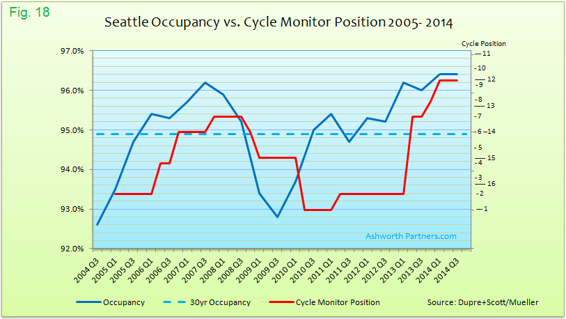
Occupancy definitely had a ‘Vee’ bottom in 2009 and by 2010 Q2 it was back over the LTA but the cycle position wasn’t keeping up. This is where the eight quarter flatline at position 2 in 2011-2013 really stands out. And the seven position catch up in 2013 Q2 might make trading currencies seem more sedate than apartment investing if apartment cycles really worked this way.
The biggest issue is that when occupancy is above the Long Term Average the market can’t be earlier in the cycle than position 6, that much is carved in stone (See Figure 8, above). Occupancy went above the LTA in Q3 2010 and stayed above since Q1 2012 but the cycle didn’t catch up until Q2 2013, almost three years after the first and five quarters after it last went above and stayed there. Note that this was an issue in the 2005-07 period as well where occupancy broke above the LTA in Q3 2005 but the cycle position didn’t get there until Q1 2007, six quarters later.
The other piece is that once rent growth turns positive the cycle can’t be lower that position 4. By Q3 2010 Seattle was back at positive rent growth but according to the Cycle Monitor would be stuck at position 2 until Q2 2013.
Why It Matters
Since we want to buy at the bottom of a rising market, or at least on the way up before the crowd wants in if we don’t find out that market is moving until months (or years) later the opportunity would be lost. If the most widely followed source of real estate market cycle positioning is missing by this wide of a margin is it the data?
If Dr. Mueller was looking at different data than what Dupre + Scott provides that might explain why the cycle positions don’t match. It turns out Dr. Mueller uses CoStar data which he said is not the best in the apartment market space but hopefully consistent over time. He also sent a chart of Costar’s Seattle apartment market occupancy:
Note that the City of Bellevue is misspelled on the chart as I received it and my good friend Mayor Balducci would be unhappy if I didn’t include the correct spelling.
At first glance it seems to follow the same path as Dupre + Scott’s (D+S) but when you map the last 10 years of both together differences do appear. Noticeably the CoStar occupancy falls below its LTA in Q2 or Q3 2008 and D+S not until Q1 2009. The even bigger discrepancy is coming out of the recession D+S has vacancy above its LTA in Q3 2010 while CoStar’s doesn’t until a year later. Granted the D+S occupancy dips 20bp below its LTA for 1 quarter in 2011.
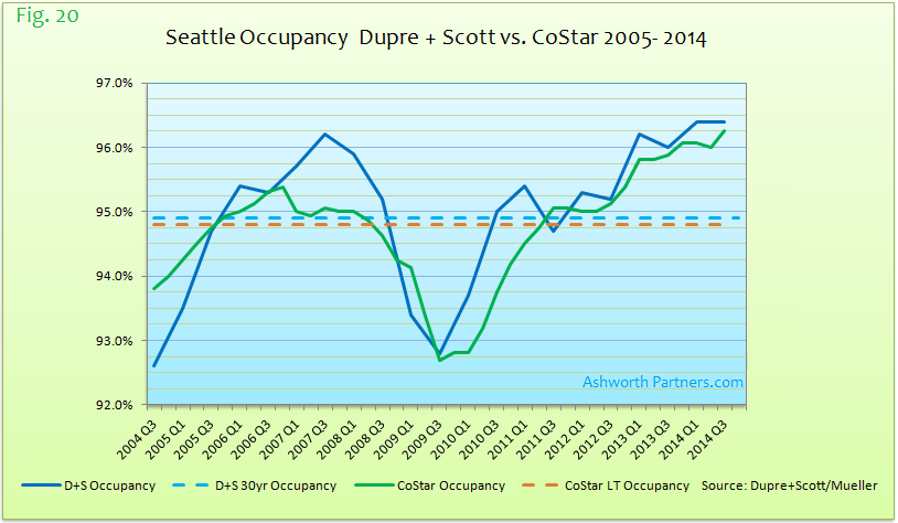
Note that CoStar’s LTA is 94.8%, 7 basis points lower than the Dupre + Scott LTA of 94.87%. But when the Cycle Monitor Positions are mapped to the CoStar data we can see that the positions are lagging even the CoStar occupancy:
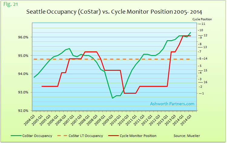
Once again, when occupancy moves above the LTA the cycle position can be no earlier than 6 and the Cycle Monitor has the position remaining at position 2 when CoStar’s occupancy breaks above the LTA in Q3 2011.
What about the cycle positions of other markets?
I looked at the Portland market and its cycle position also suffered from bouts of flatlining:

Portland’s cycle position falls to 2 just as occupancy is hitting bottom in Q1 2010 but then it flatlines for over a year while occupancy is rising back above the LTA. The cycle position does a four position catch up in two quarters but then flatlines again while occupancy is hitting the second highest level achieved in the last fifteen years. Note that this chart uses occupancy data from Portland State University’s real estate department.
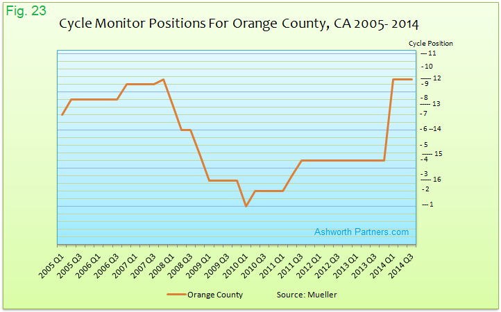
Two more that really stuck out were Orange County and Houston. Orange County has a two plus year flatline at position 4 from 2011 Q3 until 2013 Q4:
And Houston, we have a problem. Does any apartment market really go from 5 to 9 to 15 in two successive quarters?
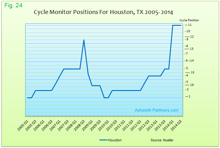
In addition to the ‘Houston Spike’ the market has its own seven quarter flatline from 2010 Q2 to 2012 Q1. Now maybe those are typical things in the OC and Space City’s apartment markets (?) but what concerns me even more is that these are two additional markets that had huge catch ups in their cycle positions. The thing about these two catch ups is they go from early in the cycle to pretty late, completely skipping over the four quarters typically spent in position 6 and thereabouts (See Fig. 6). If markets really do move this way then our understanding of ‘the cycle’ needs to be reworked. But I don’t think it’s our understanding of the concept of cycles that needs to be revamped.
When I corresponded with Professor Mueller he did not dispute any of the points I raised but he did share something that was quite revealing: “I had been holding back on many markets I thought were peaking at or near their previous peaks, but when I saw occupancies start to decline in many markets, I moved the majority into the hyper supply phase” [Emphasis mine]. He was referring to his mass movement of apartment markets in Q1 2014 where ten of the markets were moved 10 or more positions with Memphis being the ‘winner’ at +11. Note that he didn’t say that the markets moved but instead that it was he who moved the markets.
The take away is that the cycle positions were not being determined by answering the questions posed by the variables laid out in his work but more by where he thought they should be. And it forces me to conclude that the flatlines and the sudden huge movements may be caused by inattention, or a lack of research interns/undergrad students.
If that is the case then it’s easy to see how things could go off track when there are more than 250 market cycles to evaluate every quarter and there’s no set formula operating to place each market. And to be clear I’m not disputing where the market cycle positions are currently; he’s got Seattle in 12 and as he wrote to me it’s hardest to pick the tops and bottoms so reasonable professionals might place Seattle anywhere from position 10 – 13 with no argument from me.
The bottom line is that probably outside of the big name cities like NYC, Boston, LA, etc. and especially if you’re working in the apartment sector you would be better served by tracking and placing your market positions on your own*. The Cycle Monitor’s coverage of the office and industrial sectors is likely much better because the majority of Dividend Capital’s holdings are those type assets. In a future report I’ll be looking at some other markets to see what can be found for apartment investors there too.
*I will be doing just that in part 2.
Good hunting-


